編み出した。
やろうとしてること
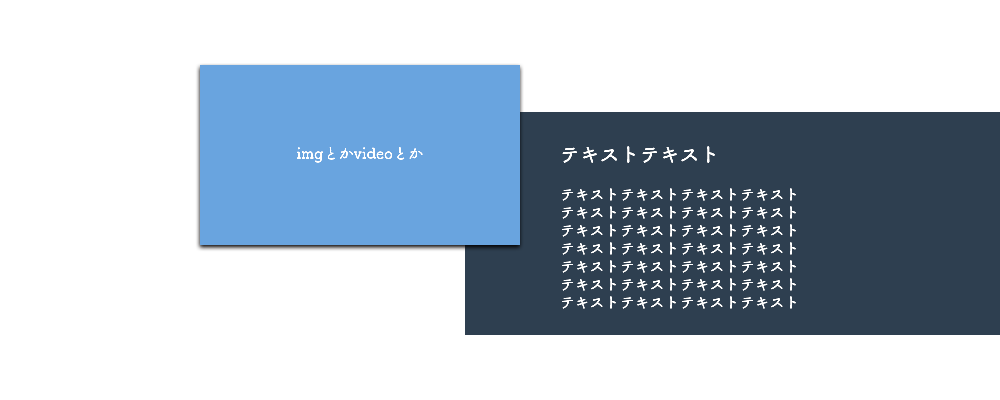
画像の通り。
・要素は左右均等に余白がある(margin: 0 auto;的なやつ)
・左右の要素が重なってる感じ
・背景は要素をぶち抜いてブラウザ端まで伸びてる
・極力HTMLを汚さない
方向性とかはこんな感じ。
まずは中身を組む

赤線の中側のところをやっつける。
入れ子をアレしてその中にコンテンツ入れて、positionでもって調整。
<section>
<div class="content">
<div class="youtube">
<div class="inner"><iframe width="560" height="315" src="https://www.youtube.com/embed/1wwhkXEkdUU" frameborder="0" allow="accelerometer; autoplay; encrypted-media; gyroscope; picture-in-picture" allowfullscreen="allowfullscreen"></iframe></div>
</div>
<div class="detail">
<h1>タイトルタイトルタイトルタイトルタイトルタイトルタイトルタイトルタイトルタイトルタイトル</h1>
本文本文本文本文本文本文本文本文本文本文本文本文本文本文本文本文本文本文本文本文本文本文本文本文本文本文本文本文本文本文本文本文本文本文本文本文本文本文本文本文本文本文本文本文本文本文本文本文本文本文本文本文本文本文本文本文本文本文本文本文本文本文本文本文本文本文本文
</div>
</div>
</section>
body{
margin: 0;
}
section{}
section .content{
width: 100%;
max-width: 1200px;
margin: 0 auto;
padding: 0 0 100px;
position: relative;
}
section .content .youtube{
width: calc(50% + 100px);
}
section .content .youtube .inner{
width: 100%;
height: 0;
padding-top: 56.25%;
position: relative;
z-index: 1;
}
section .content .youtube .inner iframe{
width: 100%;
height: 100%;
position: absolute;
top: 0;
left: 0;
}
section .content .detail{
width: calc(50% - 120px);
padding: 60px 0 60px 100px;
display: block;
position: absolute;
bottom: 0;
right: 0;
background: red; /* 領域確認用 */
}demo
ブラウザに幅が無いと左右の余白わかんないね。仕方ないね。
まずは左側を好きなようにサイズを決めて配置。
幅の指定はデザインに応じて好みでやれる。
ブラウザの中央じゃないととか、ルールが一切ないのが今回のポイント。
ついでだからレスポンシブyoutube埋め込み(16:9)も書いといた。
ネックは右側で、左側に被らせたり下にずらしたりしてる。
position:absolute;を下地に中身がかぶらないようにwidthとpaddingで調整。
下にずれ込んでるところはソースのように親(.content)にpadding-bottomを与えて調整した方が他に影響がなくてスマートだと思う。
demoの赤い背景は領域確認の為なので実際は書かない。
::afterで背景をつける
::beforeでもいいけどね。
body{
margin: 0;
}
section{
width: 100%;
overflow: hidden;
}
section .content{
width: 100%;
max-width: 1200px;
margin: 0 auto;
padding: 0 0 100px;
position: relative;
}
section .content .youtube{
width: calc(50% + 100px);
}
section .content .youtube .inner{
width: 100%;
height: 0;
padding-top: 56.25%;
position: relative;
z-index: 2;
}
section .content .youtube .inner iframe{
width: 100%;
height: 100%;
position: absolute;
top: 0;
left: 0;
}
section .content .detail{
width: calc(50% - 120px);
padding: 60px 0 60px 100px;
display: block;
position: absolute;
bottom: 0;
right: 0;
z-index: 1;
}
section .content .detail::after{
content: "";
width: 50vw;
height: 100%;
display: block;
background: red;
position: absolute;
top: 0;
left: 0;
z-index: -1;
}
右側の背景は::afterで付ける。
ぶち抜いてもいいから右側の要素の左端からブラウザの右端までを確実に埋められる幅を指定する。
z-indexを入れて重なりを正す。
背景を長くしすぎるとページの幅が広がっちゃうので横スクロールバーが発生するから、回避するためにsectionにoverflow:hidden;をつける。
完成demo
装飾
box-shadowを付けたいなって思ってもoverflow: hidden;が効いちゃってるから、左側は上部、右側は下部がちょん切れてしまう。
sectionとか.contentとかでそれ用のpaddingを足すことで回避できる。
ついでの話
コンテンツ足りないなーとかデザイン思いつかねーなーとかのための悪あがきなので、息巻いてやる系のことではないかもね。

コメント